This blog is for my GDS-102 class, and my posts are basically creative examples of graphic design that catch my eye.
Sunday, October 26, 2014
Realizing Blessings
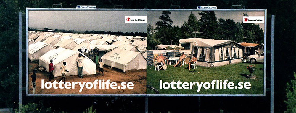
Have you ever stopped to think on your drive home from work or class just how blessed you truly are? Have you ever thought about what your life would be like if you were born as someone else with more shortcomings? This set of billboards really can put things into perspective just by glancing at them. In all three billboards, you see a side-by-side comparison of figures seemingly in the same similar pose, but in drastically different situations. The right always shows people enjoying life, while the left depicts the hardships that many people have to suffer through, based on their location. These situations are based on what family you were born into. You don't really have a choice how you are raised or what world you are living in. I love how simple, yet striking these designs are. The website for Save the Children Foundation is listed at the bottom of each image in bold white lettering. The function of these designs is to make an impact and make you want to check out the foundation's website, maybe even donate money towards their cause. I found this set of billboards in Goodvertising by Thomas Kolster.
Sunday, October 19, 2014
Spellbinding Design...Well...Maybe...
Just in time for Halloween! I'm sorry, but I couldn't resist posting this. Okay, okay, I know... it's not the best example of Graphic Design, and that's the whole point of this blog: to show great examples of Graphic Design. It may not be the best, but it certainly serves it's purpose well in this design! If anyone has seen this movie, they know just how hilarious it is, and the cover reflects that very well. This cheesy DVD cover has an over-sized moon as the backdrop of the town. The title is a typical sci-fi/fantasy Disney styled serif font, somewhat resembling the Harry Potter logo. The image of the three Sanderson witch sisters is hilarious, especially Bette Midler character's lips! It's all topped off with the corny special effects fake lightning powers coming from her finger tips. A cheesy cover for a cheesy movie is the whole point of this design. The function of this cover is to spike a humorous tone and get people to purchase the movie. It's one of my favorite Halloween flicks, and if you haven't seen it, you definitely need to check it out! I couldn't find out who exactly did the artwork, but it is owned by Disney Enterprises, Inc.
Sunday, October 12, 2014
Don't Get Shot!
This image is horrible...but absolutely hilarious! This Italian restaurant wasn't afraid to push the boundaries a bit and pull the race card. The design is fairly simple: Bold black san serif font against a grainy white background... riddled with some bullet holes. The name and address of the restaurant with a small image of the inside of the restaurant is in the bottom right corner. Everything is flushed right except for the name of the ad agency on the left. It's nice to see that some people aren't afraid to stereotype themselves for the sake of a little humor. The use of a bullet hole on the word "yet" creates a nerve-wracking undertone, but therein lies the humor. The function of this poster design is to use a playful racist joke to get people to want to check out this restaurant. This design was created for Positano Restaurant by Kirshenbaum & Bond ad agency in 1987. I also found this design in Advertising Today by Warren Berger.
Monday, October 6, 2014
One Word Impact
This just goes to show how a simple design layout can have a huge impact based on location placement. The design is so simple: a bold black word against a white background. There's a border and some text at the bottom to show what the message is actually going for, but the one word alone speaks clearly enough. Just incorporating and relating an outside bench to a bed and a dumpster to a kitchen wrenches at my heart and ties a knot in my stomach. This is probably one of the simplest designs I've ever seen used in one of the cleverest ways possible. The function of this design is to tug at people's hearts and make them want to get involved in helping the homeless. I found this design in Advertising Today by Warren Berger. This ad was created for The Miami Rescue Mission by the ad agency Crispin Porter + Bogusky in Miami, Florida.
Subscribe to:
Comments (Atom)


